SQL Tuning Best Practice – Visualizing the Query
- kyle Hailey
- Sep 10, 2010
- 6 min read
SQL tuning can be a challenge to even the most experienced database professional. So, how can you give yourself a leg up in optimizing a difficult query? As you will discover in this best practice, visualizing the query can help you quickly understand the query, as well as define its optimal execution path.
A best practice for visualizing the query is to draw the query out as a Visual SQL Tuning (VST) diagram.
A VST diagram consists of the following elements:
tables as nodes
joins as connectors
filter percentages
relationships
join sizes
Historically, SQL tuning has been limited to the following two approaches:
Explain plan for the query; and/or
Trace the query
For example, a trace output might look something like this:e
PARSING IN CURSOR #2 len=53 dep=0 uid=61 oct=3 lid=61 tim=1151519905950403 hv=2296704914 ad='4e50010c' SELECT 'Hello, world; today is ' || SYSDATE FROM dual END OF STMT PARSE #2:c=4000,e=1540,p=0,cr=0,cu=0,mis=1,r=0,dep=0,og=1,tim=1151519905950397 BINDS #2: EXEC #2:c=0,e=58,p=0,cr=0,cu=0,mis=0,r=0,dep=0,og=1,tim=1151519906034782 WAIT #2: nam='SQL*Net message to client' ela= 2 driver id=1650815232 #bytes=1 p3=0 obj#=-1 tim=1151519906034809 FETCH #2:c=0,e=29,p=0,cr=0,cu=0,mis=0,r=1,dep=0,og=1,tim=1151519906034864 WAIT #2: nam='SQL*Net message from client' ela= 215 driver id=1650815232 #bytes=1 p3=0 obj#=-1 tim=1151519906035133 FETCH #2:c=0,e=1,p=0,cr=0,cu=0,mis=0,r=0,dep=0,og=0,tim=1151519906035165 WAIT #2: nam='SQL*Net message to client' ela= 1 driver id=1650815232 #bytes=1 p3=0 obj#=-1 tim=1151519906035188 WAIT #2: nam='SQL*Net message from client' ela= 192 driver id=1650815232 #bytes=1 p3=0 obj#=-1 tim=1151519906035400 STAT #2 id=1 cnt=1 pid=0 pos=1 obj=0 op='FAST DUAL (cr=0 pr=0 pw=0 time=3 us)
Not exactly user-friendly. I think I might need a couple of double espressos before I plunge into this one.
How about an explain plan? An explain plan is better, but still lacking insightful information
--------------------------------------------------------------------------------------------
| Id | Operation | Name | Starts | E-Rows | A-Rows |
---------------------------------------------------------------------------------------------
| 1 | HASH GROUP BY | | 1 | 1 | 1 |
|* 2 | FILTER | | 1 | | 1909 |
|* 3 | TABLE ACCESS BY INDEX ROWID | PS_RETROPAYPGM_TBL | 1 | 1 | 3413 |
| 4 | NESTED LOOPS | | 1 | 165 | 6827 |
|* 5 | HASH JOIN | | 1 | 165 | 3413 |
|* 6 | HASH JOIN | | 1 | 165 | 3624 |
| 7 | TABLE ACCESS BY INDEX ROWID | WB_JOB | 1 | 242 | 2895 |
| 8 | NESTED LOOPS | | 1 | 233 | 2897 |
| 9 | TABLE ACCESS BY INDEX ROWID| PS_PAY_CALENDAR | 1 | 1 | 1 |
|* 10 | INDEX RANGE SCAN | PS0PAY_CALENDAR | 1 | 1 | 1 |
|* 11 | INDEX RANGE SCAN | WBBJOB_B | 1 | 286 | 2895 |
|* 12 | TABLE ACCESS FULL | WB_RETROPAY_EARNS | 1 | 27456 | 122K|
| 13 | TABLE ACCESS FULL | PS_RETROPAY_RQST | 1 | 13679 | 13679 |
|* 14 | INDEX RANGE SCAN | PS#RETROPAYPGM_TBL | 3413 | 1 | 3413 |
| 15 | SORT AGGREGATE | | 1791 | 1 | 1791 |
| 16 | FIRST ROW | | 1791 | 1 | 1579 |
|* 17 | INDEX RANGE SCAN (MIN/MAX) | WB_JOB_F | 1791 | 1 | 1579 |
| 18 | SORT AGGREGATE | | 1539 | 1 | 1539 |
| 19 | FIRST ROW | | 1539 | 1 | 1539 |
|* 20 | INDEX RANGE SCAN (MIN/MAX) | WB_JOB_G | 1539 | 1 | 1539 |
---------------------------------------------------------------------------------------------
Predicate Information (identified by operation id):
---------------------------------------------------
2 - filter(("B"."EFFDT"= AND "B"."EFFSEQ"=))
3 – filter(“E”.”OFF_CYCLE”=”A”.”PAY_OFF_CYCLE_CAL”)
5 – access(“D”.”RETROPAY_SEQ_NO”=”C”.”RETROPAY_SEQ_NO”)
6 – access(“C”.”EMPLID”=”B”.”EMPLID” AND “C”.”EMPL_RCD#”=”B”.”EMPL_RCD#”)
10 – access(“A”.”RUN_ID”=’PD2′ AND “A”.”PAY_CONFIRM_RUN”=’N’)
11 – access(“B”.”COMPANY”=”A”.”COMPANY” AND “B”.”PAYGROUP”=”A”.”PAYGROUP”)
12 – filter((“C”.”RETROPAY_PRCS_FLAG”=’C’ AND “C”.”RETROPAY_LOAD_SW”=’Y’))
14 – access(“E”.”RETROPAY_PGM_ID”=”D”.”RETROPAY_PGM_ID”)
17 – access(“F”.”EMPLID”=:B1 AND “F”.”EMPL_RCD#”=:B2 AND “F”.”EFFDT”<=:B3)
20 – access(“G”.”EMPLID”=:B1 AND “G”.”EMPL_RCD#”=:B2 AND “G”.”EFFDT”=:B3)
If I was greeted with this first thing in the morning, I’d definitely get a coffee before attempting to operate on it.
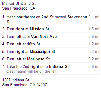
The explain plan is just a set of directions that the database takes to retrieve the data from the database in order to satisfy an SQL query. An analogy would be if we imagine the SQL query as a google maps request for directions to get from my home in the suburbs to my office downtown. The explain plan is like the turn-by-turn route list. But for any of us who have gotten lost well know, it’s also nice to be able to see the map as well as the turn-by-turn directions.
If google maps only gave me the directions without the map I’d be pretty upset, probably lost and totally anxious about how long it’s going to take me to get to my destination.
Are these a good set of directions? (from where I live to where I work, in San Francisco):

It might help if I had a map:

On the map, the directions look pretty sensible, but what if there was a traffic jam on some streets and not others? How about a map that included traffic jams (i.e. bottlenecks)?
Whether the turn-by-turn directions are good or bad requires a map (i.e. visual information). So how do we get a map of for an SQL query? Let’s start with the terrain. We can describe the terrain by laying out the tables in the query graphically and drawing connectors for every join, or routes through the diagram. A diagram could look like this:

Now we have a map of the terrain. Seeing the terrain allows us to pick out an optimal explain plan. To pick an optimal explain plan, find tables that have the most selective filter and start the execution there. In the above case there is only one table with a filter. This filter is denoted by the F icon on the table BROKER. Start at BROKER and then look for joins that keep the running row set size to a minimum. The running row set size is the number of rows we carry from the previous node to the next node in the VST. We have to visit all the nodes, but the fewer rows we have to carry with us from one node to the next, the faster we’re going to arrive at our destination.
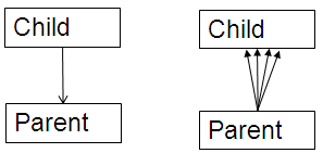
Whether you draw out the VST by hand or use a tool, a best practice is to draw the child table above the parent table. This layout encourages us to navigate the VST join down to keep our running row set the same size vs. joining up which will generally increase the row set size:

Thus, the idea is to start at the most selective filter and join down before joining up. In our example there is only one filter on BROKER, so we start there, we join down to OFFICE_LOCATION, then finish off with CLIENT_TRANSACTION, and end at CLIENT.
But what if we have more than one filter and we have to choose? In that case we have to calculate the filter percentage. The filter percentage is simply the number of filter rows divided by total rows in the table. Filter rows are the number of rows returned after applying the filter criteria on that table from the query.
In the diagram below, BROKER is the most selective filter at .05% so we start at BROKER and follow the same path as we just discussed:

But what if we don’t have access to any information identifying the parent-child relationships (such as PK/FK constraints, unique indexes or unique constraints)? In those cases, we may be looking at many-to-many relationships. With many-to-many relationships, it’s unclear how to navigate the VST. We no longer know whether to join up or down. To solve this impasse, we can add the two table join row sizes to help us navigate. Below, we’ve drawn the two table join sizes on the join lines:

To navigate the VST above, we again start at BROKER with the most selective filter, then look for the smallest two table join size which is OFFICE_LOCATION with a join size of 3. Then we join to CLIENT_TRANSACTION and finally CLIENT.
As you can see, VST diagrams act like the map for the terrain that an SQL query has to navigate. When a simple map is not enough, we can add statistics such as filter percentages and two table join sizes to complete the map. VST diagrams can be drawn on paper, with tools such as Visio or with database products that draw them automatically using the SQL query, schema definitions and table statistics.
For more perspective on the visual approach to tuning SQL and drawing VST diagrams see
SQL Tuning by Dan Tow
Refactoring SQL Applications by Stephan Faroult , chapter 5
“Designing Efficient SQL: A Visual Approach” by Jonathan Lewis


Comments